On Facebook ( that noted art history forum:-)
Matthew Collings posted the following:I have highlighted what seems to me the key lines. The second paragraph is his introduction to the set of photos which even I,as someone accused of convoluted and dense and unreadable sentences,found hard to fathom and only after several re-readings did I get a sense (I think) of what he on about. My interpretation is he is concerned that at a time when we surrounded by a tsunami of visuality (more artists,more imagery than ever) that there is no coherent ethical and aestheticâ agreement of what is good or right . i.e. that we live in immoral times and that affects judgement too. This chimes with the Rediscovering Aesthetics standpoint. I do not know to what degree he agrees/disagrees with their views. The idea of visual achievement V visual success may be contrasting actual artistic creation with visual success i.e. cheap fame low artistic worth..I am not sure. Below my response on facebook and a continuation of my objective argument which I apparently regularly fall short on woof woof:-)
Matthew Collings: On some very visual and recent art
If there is celebrating it’s celebrating the visual dimension,but the reason to post the album (and others) is not ”let’s party’ but to look at the possibility of visual substance,depth,richness in art,’ because in the general idea of what contemporary art is that operates at the moment this visual dimension is virtually either actually absent or else unseeable (and consequently undiscussuable or unappreciatable).
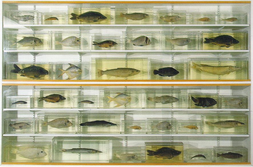
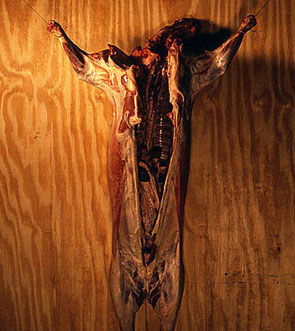
Some very visual current and recent art:
Reassurance of pre-modern and even modern art no longer available universal Rembrandtian Shakespearean etc greatness out now meantime fragmentary but very visual art does exist. Problem in heads is to get visual to connect with ethical. Many steps. First is to be visually observant. Then questioning. What is all this visuality for? How can we make it be for something else,something better? (That is not for wrong ideology,wrong life dictated by consumerism etc,as exemplified horribly by contexts in which this art is actually usually seen.) And is a visual system aiming at high visual achievement,or visual success and which therefore has the possibility of failure and therefore entails some kind of judging is it connectable to moral and ethical dimensions,political dimensions etc? (Nazis judging good notes in symphony,still chuck victims in ovens etc.) Or do we have to accept visually abject art that has moral excellent credentials? Plus accept visual abjection that has excruciating pseudo thoughtful credentials (idiotic pretence at engaging with history society etc while remaining in-crowd smugness only)?
My response:Part one ( from facebook)
Ironically my period of intense engagement with painting coincided with the publishing of artscribe which was my bible in mid eighties. I stopped any meaningful production of art in 1992 and am now trying to begin again. So in some ways I am heavily influenced by the artscribe ethos and coming back to the art world I acutely aware of the marginalisation of visuality and the lack of a coherant and representative forum/magazine for that visuality. Both Modern Painters and Frieze seem to be ad driven fashion mags and art monthly is simply art monthly…long on theory short on images. My feeling (I will expand later) is we are at a watershed moment and that all this visuality is not looking,making and time based to the same extant it once was in the artscribe era. Fragmentation is an aspect of globalisation and the rise of the internet which may also mean a fragmentation of values as you hint at. Could artscribe exist now at all in the same moral and tightknit way it did in the 198’s when it ring-fenced not only a seriousness about painting etc but also a relatively coherent worldview and small set of tuned in artists? We live in a bigger artworld but not necessarily a more serious or a more productive one. Was artscribe a magazine dedicated to visuality.
My response: Part two
ARTSCRIBE
I have written about artscribe as part of a longer piece called Beyond the crisis in art ‘Making and Doing’which covers the artscribe years.
http://belcheresque.wordpress.com/2009/11/16/beyond-the-crisis-in-art-making-and-doing/
Whatever it was (for those too young or unaware of the magazine) artscribe was the most important magazine in the period 1976 -1985 after that it became Artscribe International and I felt lost its way and became a precursor of the fashionista art mags we have now. early artscribes were ad free tomes of high-seriousness where you could enjoy lengthy,erudite articles on painting especially from the likes of James Faure Walker,Matthew Collings and Adrian Searle. Collings himself is representative of the gradual change and led to the Internationalisation fo the magazine. My feeling has been that the success and failure of Collings’s internationalisation is a smaller model of the sea change in British Art at this point i.e. Sensation et al. Ironically Collings left the magazine in 1987 after which it went downhill fast and disappeared totally in 1993. My only surviving copy is ironically from Collings time as editor because I feature in it albeit in a very minor role as a model in a Gilbert and George painting called Gateway which featured in an article on them. That was about as close as I ever got to the International Art World. So any discussion of artscribe and visuality and its apparent ‘demise’ cuts heavily into my own artistic history or suicide depending on your viewpoint. Now this is where things get interesting in searching for the artscribe image I came across Matthew’s Rant from the saatchi magazine.
http://magazine.saatchionline.com/magazine-articles/reports-from-new-zealand/put_downs_and_suck_ups_matthew_14
In it he discusses Peter Fuller. Ironically I was interviewed for Goldsmiths course in 1987 and 1988. The first time of interview I had recently completed a black empty canvas for painting and sat bewildered as Mary Kelly and Nick De Ville pontificated about it for what seemed hours (I too shy to point out it just a ground!) before telling me I interesting and they would come back next year. Sadly my studio was demolished and penniless the next interview was in my legalised squat in Arnos Grove and a disaster.
Basically I uttered the name Peter Fuller and it was if I had shat all over the assembled interviewers (and a postgrad student who hung bing bags on hooks who ignored me and spent whole time staring at out coathooks). Now reading the Collings piece I understand how evil I had been. Collings explains
When Modern Painters began in 1988 it was the brainchild of an art writer called Peter Fuller,a man loved by fogeys and philistines,and middle class people who kidded themselves they were into art,while the art world as such couldn’t bear him. I couldn’t bear him either,at least not what he wrote. It always seemed so off the mark.
My Response:Part three
In contrast I had actually read and re-read Fuller intensely ( especially Beyond the Crisis in Art)and loved him and Modern Painters under his editorship. He seemed then and seems now to have been way ahead of the YBA pack. Ironically Matthew seems to have revised his opinion somewhat.
The bits I like are,mainly,his raving on (positively) about Ruskin,who in those days I didn’t know anything about and didn’t care to learn anything about. Now of course I think Ruskin’s great and in fact I believe only an idiot wouldn’t think the same. As a personality,Peter (who I got to know fairly well) was great too.
So I was victim of an almost Stalinist rejection of a certain way of looking at art. The Goldsmiths tutors gave me short shrift refusing to even look at my Bacon and Sutherland influenced self-portraiture. I was a rank conservative..an amateur who did not understand the mission that Goldsmiths and YBA about to launch ( obviously the offer of a place at the Royal College for painting by Peter de Francia in 1981 was a figment of my imagination sadly I was scuppered by Thatcher’s plan to give working class children a place at public school..guess what she took the money from the R.C. ensuring a foreign student took my place and this working class boy ended up on the dole). Forgive me if the International Art World leaves me a little sarcastic..wouldn’t you feel the same? Goldsmiths or Thatcher it all the same to me.
I ran out of critical road and ended up back in my parent’s council house in Didcot and immediately spent a year drawing the hills around my hometown in charcoal on location and effectively became as conservative as possible in reaction to the Goldsmiths debacle. My art career effectively over I went to ground just as Hirst and Emin won the art lottery. I continued to read Fuller and Ruskin and to ignore the London art scene for the next 20 years and pretty much still do. My artistic career petered to a halt with some etchings at Edinburgh College of Art in 1994 and that was that until Moogee in 2005. So that was then but what about now and what about this contested visuality everybody banging on about continues below. In it I hope to link the processes at play in 1988.Goldsmiths, internationalisation, YBA’s to my own career crash and the birth of Satchi Land which more than anything both created and destroyed the visuality bubble.
My Response: Part Four
VISUALITY?
THINGNESS?
Responding to internet representations of art.
Interesting point here is you probably encountered both works (Stella and Morris ) in reality whereas I think I only ever seen one actual Stella and no Morris so have no idea of scale or construction of Morris so how could I really compare which brings us back to key point re. visuality..whose visuality .We are engulfed in a pervasive media which displays versions of reality..how many dscourses based on actual seeing any more..perhaps we need an institute of looking?
If we could assemble all the paintings you have here and make people actually look the responses may be very different. What we have here is a virtual gallery that lacks the essential thingness of objecthood . If one not responding to that essential object but only a virtual mis-representation then we are always on dodgy ground. What I find infuriating about contemporary theorists of the virtual is they discount the essential veracity of constructed artworks to them and their students (and NTU has its fair share) they are continually avoiding the real by dancing spectacularly in clouds of theory and networks never touching the ground and certainly never needing to look at all..Ruskin would be appalled.
Conversation re; Artscribe with Matthew Collings: from facebook June 2011
SDB
Has visuality disappeared as much as you say across the board. I thought it just a Nottingham thing ..it almost eradicated from the fine art course because of all those elements I been ranting about for years .I didn’t even attend the PV of my own School as seen one blackboard with a Wittgenstein quote on and a screaming performance artist you probably seen them all;-) Really enjoyed selection could this not make a great Art Commentary stand alone website ..or interactive TV show.
Ironically my period of intense engagement with painting coincided with the publishing of artscribe which was my bible in mid eighties. I stopped any meaningful production of art in 1992 and am now trying to begin again. So in some ways I am heavily influenced by the artscribe ethos and coming back to the art world I acutely aware of the marginalisation of visuality and the lack of a coherant and representative forum/magazine for that visuality. Both Modern Painters and Frieze seem to be ad driven fashion mags and art monthly is simply art monthly…long on theory short on images. My feeling (I will expand later) is we are at a watershed moment and that all this visuality is not looking,making and time based to the same extant it once was in the artscribe era. Fragmentation is an aspect of globalisation and the rise of the internet may also mean a fragmentation of values as you hint at. Could artscribe exist now at all in the same moral and tightknit way it did in the 1980’s when it ringfenced not only a seriousness about painting etc but also a relatively coherant worldview and small set of tuned in artists? We live in a bigger artworld but not necessarily a more serious or a more productive one. Was artscribe a magazine dedicated to visuality?
MC
Well ironically Artscribe was very much a visual celebrating mag under the editorship of its founder James Faure Walker,but when I took over,in early 80s,it became much more oriented to bringing news to UK of international trendy developments,and ultimately to airing info about those developments back to places where they originally came from —I wouldn’t say ethos of mag in my time was at all like ethos of these FB threads,which is because my true interests,while they were always there,were a bit buried in those days beneath my drive to make the mag buzzing and powerful.
SB
That is really interesting Matthew ..so you are more naturally attuned to JFW content than your own in hindsight? Do you think there a current magazine that caters for visuality and here I using term loosely to denote contemporary visual art where the emphasis on objecthood . I struggling to put it more clearly maybe in sense defined by Abigail Diamond here.
The role of the art object in contemporary art http://sitem.herts.ac.uk/artdes_research/papers/wpades/vol3/adfull.html
i.e. are we talking about art that reveals itself primarily as an object..in which case OBJECT would be perfect title for such a magazine !
This conversation was extended into a full article for MATTER magazine available HERE:


Recent Comments